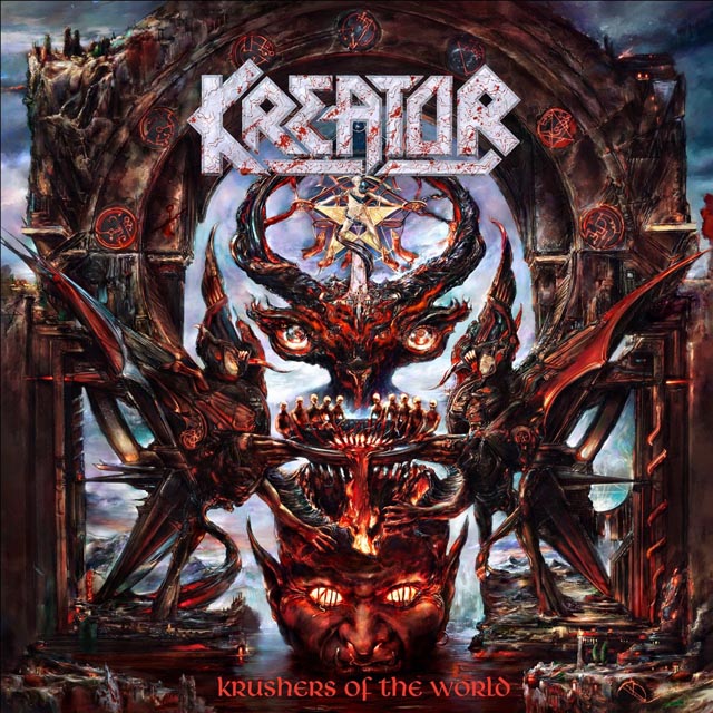
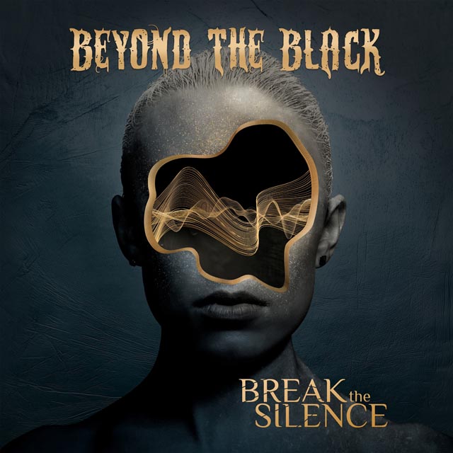
 Of all the places you’d expect to hear about the new Mastodon album, The New York Times isn’t necessarily one of them. But the band’s new album, The Hunter, was one of the focal points of an article in the paper yesterday about how album covers are becoming more and more simple. The culprit? As sales of physical albums decline, album artwork will increasingly be viewed on smartphones and iPads as less people buy physical product. As a result, many labels are making artwork knowing that many people will primarily be viewing it at about the size of a postage stamp.
[Donny] Phillips of Warner Brothers, who designed the Mastodon cover, was instructed to work with a sculpture by the artist A. J. Fosik, who creates striking wood sculptures looking like three-dimensional folk art. Mr. Phillips created different mock-ups, including one using multiple versions of Mr. Fosik’s work. But in the end Mastodon went with a single image. “They have a history of intricate album covers,” Mr. Phillips said. “But the feedback from the band was, ‘This will stand out digitally.’ ” Mr. Phillips added that the band’s decision is “not a dumbing down, but an aesthetic shift.”
Having grown up scrutinizing album covers and liner notes, it’s definitely a bit of a bummer to have seen album artwork continually shrink. The 12 inches that vinyl records had were almost a canvas, and when it shrank to the 4.9″ by 5/6″ specs of a CD case, it still wasn’t quite as jarring as to the presumed one or so square inches of a photo on the iTunes Music Store. While we were somewhat surprised that Mastodon decided, for the first time in their career, not to work with Paul Romano, you can’t fault the band for trying something different, and it makes sense in the context of what labels are saying about making art that’s eye catching regardless of what size it is. Also, it wouldn’t be surprising to Mastodon continue to work with Romano on bigger mediums, like the inevitable vinyl release of The Hunter. The new album will be out on September 27.


